Home

Thursday, December 8, 2011

We have a winner!

First of all I'm sorry for being a day late with announcing the winner of the Advent Calendar Giveaway.

But we do have a winner!!!

~.....~.....~.....~.....~.....~.....~.....~.....~.....~.....~.....~
Michelle said...
Happy Holidays! Thanks for the fab giveaway!
~.....~.....~.....~.....~.....~.....~.....~.....~.....~.....~.....~

Michelle, please email me (danielle.de.konink @ gmail.com) your info where to send your goodies to. You'll have untill midnight PST December 10th to claim your prize. If not claimed I'll do a new drawing.

Thank you all for playing along and I hope you'll enjoy the rest of the Advent Calendar Giveaways! Don't forget to leave a comment on Leah's blog for the chance to win a 3 month subscription on My Scrapbook Nook kits!!!

Happy Holidays to all of you!!!


Saturday, December 3, 2011

The Nook Advent Calendar Giveaway

Today is my day to host a giveaway for My Scrapbook Nook Advent Calendar Giveaway. The giveaway is a little Sassafras package with two glitter alpha sheets, two sets of vintage brooches and a clear stamp set.

To make a chance to win this, just simply leave a comment before tuesday 6th of December 11.59 am PST. I'll do a drawing on Wednesday and the winner will have three days to claim the prize. If not claimed, I will do a new drawing.

Make sure you also hop on over to Leah Killian's blog and get entered for the grand prize sometime between now and Christmas Morning. You could win a free subscription to the always inspiring Nook kits!

Have fun playing along with the Advent Calendar Giveaways!!

Thursday, December 1, 2011

Play along: My Scrapbook Nook Advent Calendar

I'm so excited to share with you the Advent Calendar at My Scrapbook Nook. Me and 24 Nook friends are hosting a giveaway during the count down to Christmas. Every day untill Christmas (starting today!!) 1 Nook girl will host a giveaway, so make sure you will check out the Nook blog daily to see who is hosting a giveaway.

So have fun playing along!

ps little hint: check this blog Saturday the 3rd ;-)


Monday, November 21, 2011

Configuration box Christmas

I'm not so much a Christmas decoration person, but my mom is the world champion in Christmas deco. So I thought she would like some new decoration and I created her a Configuration box in Christmas style. I did all the basics and now it is up to her to fill the boxes with tiny Christmas stuff. She's got plenty of that, so I'm sure it is going to be a stuffed up. I was guessing she wanted it to be clean and simple and I was right about that. I suggested some other things to add on, but none of it she wanted. It was just good as it was. Yay, I did a good job. lol
I covered the sides of the lid with paper from the Tim Holtz paper stash Seasonal, inked the rest of the lid with Distress Ink Peeled Paint and added some Idea-ology Corners on the corners of the lid with Inkssentials Glue and Seal. The inside boxes are inked with Distress Ink Peeled Paint and Barn Door. The inside backs and bottoms of the boxes are also covered with papers from the Seasonal stash.
Here are some pics of the box. I took out the acetate to avoid there would be a reflection in the pictures.


Saturday, November 19, 2011

Basic Grey sketch

I loved this Basic Grey sketch immediately, so I just had to make it. Even though I was way too late to participate in the challenge. I used the Hello Luscious papers, they are so cute. I took those pictures during a day of babysitting my niece Phiene. What better to do than taking her to the playground where she was running and playing around untill she knocked herself out. She went sitting on a bench and told me: now you go play ;-)

This is my take on the sketch. TFL

PP: Basic Grey Hello Luscious
Title: Hello Luscious on grungeboard with QK Heidi Swapp Handwriting. Covered it with Glossy Accents
Flowers: white embossed  with Hero Arts stamp Many Petals on Hello Luscious paper
Brads: Imaginisce I-top tool with Hello Luscious paper
Bottom strip: stamped the word Joy with Distress Ink Shabby Shutters and embossed it with Distress embossing powder Shabby Shutters
Stitching by hand (I sooo need a sewing machine...) 

Wednesday, November 16, 2011

Florida 2011

I realized that I never showed all the photo's of the mini album I made about the family trip to Florida last April. It was so great to be on this trip with all the people that I love the most: my father, my uncle Rinus, my cousin Angela, her husband Jan and their little girl Phiene. We rented a RV and drove around Florida, starting end ending in Orlando.
For this album I used Teresa Collins covers and all the papers are from the Simple Stories Destinations collection. The journaling cards and photo mat elements from Simple Stories are perfect to create pages for a mini album. The most time I spended for making this album was on stitching the pages (by hand!!).
Other things that I repeated throughout the book was QK typist, ribbon, small coin enveloppes and tags. For the inside of the front cover I searched the internet for an old map of Florida and printed it on cardstock.
Here are the photo's of the album:


Saturday, November 12, 2011

Sassafras' Grand Finale Sale boxes

On the end of October Sassafras was having their Grand Finale box Sales and I just had to have them. I ordered both boxes (the big and small one). Today they finally arrived and OMG what a party it was to unpack it. Sassafras has been so generous, that I have to share it with you. I made a couple of pictures because it was too much to get in one picture.

Here are the paper whimsies, chipboard numbers and some flowers
Here are the cardstock alpha and sweet stickers
And different lines of paper with matching sheets of flag banners, journaling tags and foldies


Many of the paper sheets are double so I can use both sides of it.
Sassafras, thank you so much for being so generous!!

Tuesday, November 8, 2011

Printing journaling

Today I was reading Lydia Jackson's blog about journaling and printing it on your patterned papers. It is quite similar to how I print my journaling, but I would like to take this a little step further, so you can use any small part of paper to print your journaling on.
I took some pictures and screen prints to make it clear.

For this example I used this piece of patterned paper:

To print this way you need Word on your computer. I'll explain this for Windows 2003 / 2007 because that is what most of you will have. If you need any explanation for Windows 2010, please let me now. It is not that much different, but you just need to know where to find what you need. My screen prints are in Windows 2010 though.

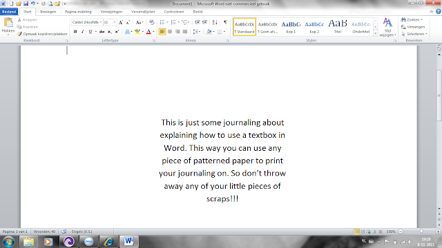
Ok, first you start creating a textbox in Word. You click 'Insert', then 'Textbox'. Click in the textbox that appeared in your screen, then go to 'Format', then 'Textbox' and then 'Size'. Measure the space on your piece of paper where you want your journaling and you add those measurements in the 'Size' screen. In this case it is 8cm x 5cm (sorry, my laptop is Dutch LOL). Then move the textbox a little to the middle of the page. This is what your screen looks like:

Type your journaling in the textbox and edit it any way you want with fonts, color etc. If your journaling is too long for the textbox, just simply down size your letters. Or make them bigger if your journaling is not long enough to fill up the textbox.


Now, you don't want that square to be printed on your paper, you just want the text. Click in the textbox, then click 'Format', then 'Textbox' and then 'Colors and borders'. Choose 'no border'.

Print this on some cheap printing paper.


Place your piece of patterned paper over the printed part (sometimes it helps to hold it against the window to see through) and adhere it with some scotch tape around the edges. Be sure that there is tape over every edge and corner of the patterned paper, so it won't get stuck in your printer. And be sure there is no tape on any part where your journaling will be printed. Later on you will see why....LOL sorry I did this one in a little hurry.

Place the printing paper in your printer the exact way you did the first time. Peel off the scotch tape carefully, so it won't damage your patterned paper.
And there is your printed journaling.
As you can see, the last word is not completely printed because there was tape over it. But you get the idea.

I hope this will help you all with printing your journaling. Especially those of you who don't like there own handwriting, like myself.
If you have any questions, please ask!

Saturday, November 5, 2011

Grungeboard addiction

Lots of Tim Holtz stuff on this one. I have a new addiction on my layouts lately and that is grungeboard. Before I used chipboard many times, but now I discovered grungeboard and it is so much easier to work with. On this layout I used the grungeboard alpha and embossed it with a wooden pattern (which matches nicely with the wooden house on the pictures) and inked it with Walnut Stain Distress ink.

PP: Tim Holtz - Idea-ology Shabby Vintage
Distress Inks Broken China, Spun Sugar, Walnut Stain
Grungeboard Alpha
Texture Fades embossing folder Woodgrain
On the edge die Brackets
Clearstamps Flourish
White flower ribbon colored with Distress Stain Spun Sugar

Sunday, October 30, 2011

Jillibean Soup Sketch

When I saw this sketch, I knew I had to make it. This is totally my style: clean and simple. I love the Jillibean papers and matching stickers!!

This is the sketch

And this is my take on it
PP:Jillibean Soup Homemade 6 Bean Soup - Navy Beans
      Jillibean Soup Homemade 6 Bean Soup - Black-Eyed Peas
Cardstock Stickers: Jillibean Soup Blossom Soup - alpha and flower
Label: Jillibean Soup Homemade 6 Bean Soup - Soup Labels
Border: Jillibean Soup Homemade 6 Soup - Pea Pod Parts
Circle: Jillbean Soup - Journaling Sprouts
Other: QK Studio - circle punch - grungeboard - Zig pen


Thursday, October 27, 2011

Get Picky Sketch Challenge

As usual I'm not doing anything untill the last moment. Same happened this evening with the sketch challenge for the Get Picky blog in honor of their first blog-birthday. And the result is that now it is dark and I'm not able to take a bright sharp picture of my layout..... Usually I scan my layouts to get the best result, but that is not possible when there are thick addings on your projects, like the rosettes on this layout. So I tried to get the best I could with my camera and hope for the best... Lesson learned: don't wait untill the last moment! Though I created this layout much faster than usual LOL

This is the sketch

And this is my take on it


Everything I used is from October Afternoon Boarding Pass collection, except for the metal rim from Making Memories.
These are pictures of my trip to Rome. On the left picture there is an overview of the Spanish Stairs (Scalinata della Trinità dei Monti) on the Spanish Square (Piazza di Spagna). The right picture is a more close up of the stairs with me on it in the middle. Not very obvious with this dark picture of the layout, but I will try a better one tomorrow.
Now off to bed, have to be at the office in 8 hours....*yawn*
TFL

Edit 10-28-2011: changed the picture of the layout to one made by daylight.

Monday, October 24, 2011

Bo Bunny Card Challenge Tuesday

Yes that is kinda shocking, right? Me doing cards!! But I really liked the sketch, so I thought let's give it try. I liked to pick a not so common subject for a card and that worked well with the Bo Bunny Barefoot collection.
This is the sketch

This is my take on it (I took the picture a little from the side, otherwise the colors didn't come out that bright as they are)

and a little 3D view ;-)

Patterned Paper: Bo Bunny Barefoot & Bliss - Laid Back, Word and Stripe
Card base: white cardstock inked with Distress Wild Honey and sprayed with a mix of water and perfect pearls
Top Border: Bo Bunny Barefoot - Backyard Bliss Cardstock Stickers
Airplane die cut: October Afternoon
Border Punch: Martha Stewart
Alpha dies: Quickutz Typist
Flowers: Hero Arts stamp on Barefoot Laid Back Paper, white embossed it
Ribbon: unknown 
Corner punch

TFL

Sunday, October 23, 2011

My Mind's Eye Blog Challenge 28

Today I enjoyed My Mind's Eye Challenge #28.
This is what the challenge is:  Design a layout based on this wonderful sketch and use “FALL” as your theme (sketch by Anam Stubbington).
This is my take on it:


MME Stella & Rose Mabel "Joy" Crocheted Paper
MME Stella & Rose Mabel "Joy" Woodgrain Paper
MME Stella & Rose Mabel "So Sweet" Herringbone Paper
MME Stella & Rose Mabel "Little Lady" Posies Paper
MME Stella & Rose Label Stickers
MME Stella & Rose Sticker Tag
MME Good day Sunshine button diecuts
Tim Holtz grungeboard alpha
Tim Holtz Rosette Die
Stiched the papers by hand

As I don't have that much fall pictures, I had to search for them. These are pictures of my little niece Chelsie when she was only 1 year old (she is 7 now, time flies!!). I thought those would be perfect for this sketch and choose to print them in black and white because the papers are bright allready and now the pics pop out of the page pretty well. TFL